Dark Patterns in UX Design at Banks
An anonymized banking case shows how a reward, unclear purposes, and repeated prompts can distort consent.
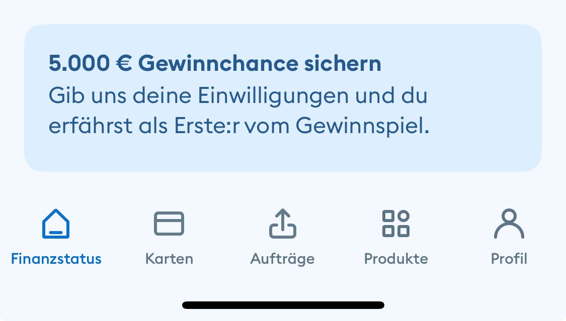
In a locally archived screenshot from a German banking app, a message above the account balance asks: “Secure your chance to win €5,000?” The bank, the date of the screenshot, and the complete consent flow cannot be independently verified from the material. I therefore treat the scene as an anonymized case reconstruction, not as a legal allegation against a particular institution.
“Dark patterns” is the common search term. The European Data Protection Board now uses deceptive design patterns. Its Guidelines 03/2022 apply to social media.1 Their categories are a useful review aid for other interfaces, but they do not by themselves determine how a banking-app case should be assessed.
Three risks in the reconstructed flow
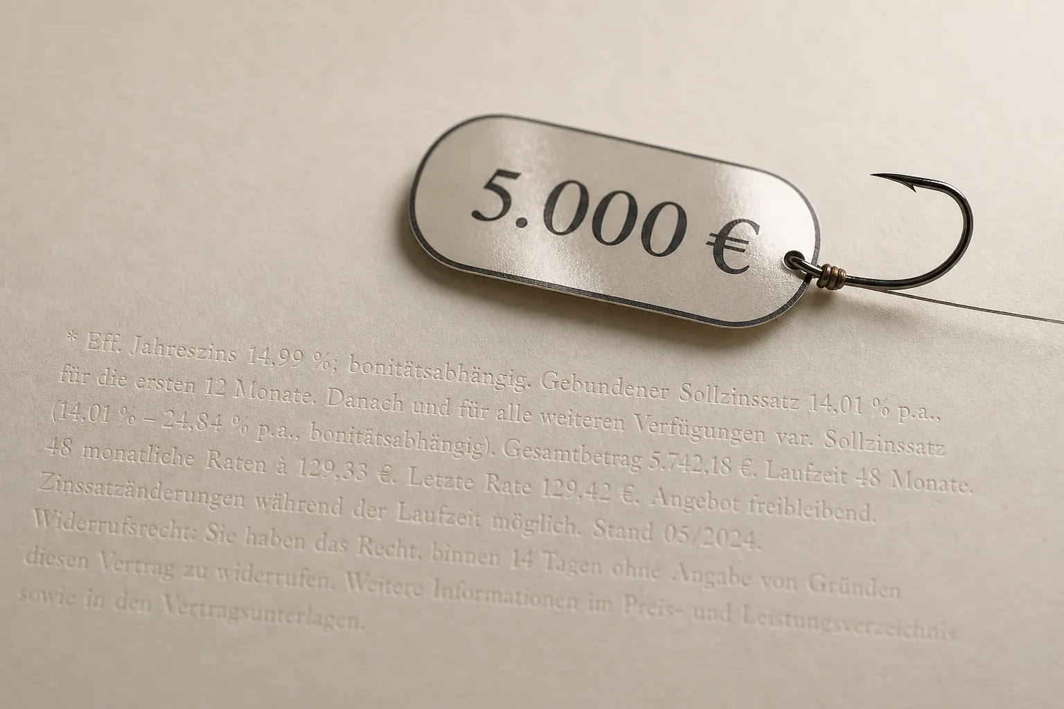
- The Golden Calf (framing). The amount is prominent, while the data processing and conditions can easily recede into the background. In EDPB terminology, this kind of emotional or visual steering may fall under Stirring.
- The Grab Bag (concealed intent). “We want to keep you informed” says little about which transaction data will be processed and for what purpose. Unclear or contradictory information fits the category Left in the dark.
- FOMO (artificial urgency). If the dialog reappears after a refusal, it can encourage consent fatigue. The EDPB classifies repeated prompts as Overloading. The single screenshot does not, however, prove that this repetition occurred.
The interface does not reveal the provider’s intent. It only shows which questions a UX and data protection review should ask. A lawyer friend I showed the screenshot to thought the setup called for an explanation, but would not assess it legally without the complete flow: an impression, not a legal opinion.
The five-point check
| Review question | What the interface should show |
|---|---|
| Which data? | The specific data category, not just an umbrella term such as “transaction data” |
| What for? | A clear, specific purpose for the processing |
| What do I give in return for the chance to win? | The terms of participation and what users provide in return, shown in the same decision context |
| How do I refuse? | A refusal that is equally clear, easy to reach, and carries no disadvantage |
| How do I withdraw consent? | A discoverable route that is no more difficult than giving consent |
The EDPB overview of consent summarizes four cumulative requirements: consent must be freely given, specific, informed, and unambiguous.2 The GDPR adds requirements including transparency, purpose limitation, data minimization, and withdrawal that is as easy as giving consent.3
Whether the reconstructed arrangement would be lawful depends on the complete flow and the specific processing. The screenshot is not enough to determine that. Even before a legal assessment, however, UX can test whether people understand the purpose and the data being processed, recognize a genuine alternative, and can find the withdrawal route without having to solve a puzzle.
A clearer alternative
A fair dialog starts by naming the action: “Analyze account transactions for personalized information.” Directly below it are the data category, purpose, retention period, and withdrawal process. “Agree” and “Continue without analysis” are equally easy to find. The prize opportunity is explained separately unless it is necessarily tied to the consent.
Article 25 of the Digital Services Act prohibits certain manipulative interfaces used by providers of online platforms. An ordinary banking app does not fall within that scope for that reason alone. For this case, the EDPB guidance and the GDPR provide more precise reference points for review; neither replaces a case-specific assessment.
Unclear consent UX carries particular weight at a bank because it concerns a sensitive decision within a relationship of trust. Good design makes both the reward and what users give in return equally clear. It does not hide refusal and withdrawal in the small print.
Takeaway
Dark patterns work because they are faster than your own judgment: the design gets you to “yes” before your brain has time to think “wait a second.” The countermeasure is unspectacular but effective. Show what you give up as clearly as what you gain, name the intent plainly, and skip the artificial countdowns. This is how I work.
Sources & References